


It’s been a while since we started to create custom data dashboards for our clients. Many of them have unique needs around email statistics and “their own story” to be told, so we decided that one fixed set of metrics wouldn’t serve them all.
We concluded that for email analytics one size doesn't always fit all.
And since that very beginning, we’ve relied mostly on Google Data Studio for our custom dashboards. Why? Well, it’s free to use, that really helps. But also because it’s very simple to use and it is incredibly flexible in terms of design and composing your own data story. All of our data is stored in Google BigQuery, so of course that helped too. You can get set up in seconds.
Quickly, we detected an issue: our team didn’t have the tools to make sure the quality was consistent across all dashboards. We had no way of making sure all dashboards were visually stunning. We were relying on the eye of our engineers and project managers instead of leveraging our own design skills and resources. And every eye is different, meaning our finished dashboards started to look different.
So we set up a few meetings with our Product Designer, and the challenge took shape:
How can we make Data Studio dashboards visually consistent and stunning, without involving a designer?
Our Product Designer worked for a while, quickly learning the details of Data Studio, and showed up at the next meeting with a solution: let’s build a proto-design-system-pattern-library for Data Studio!
The theme
We applied our own style guides to the Data Studio theming options, and we created a template dashboard that contained this theme, as well as a starting grid. By copying this dashboard when starting a new one, you’re already on your way!
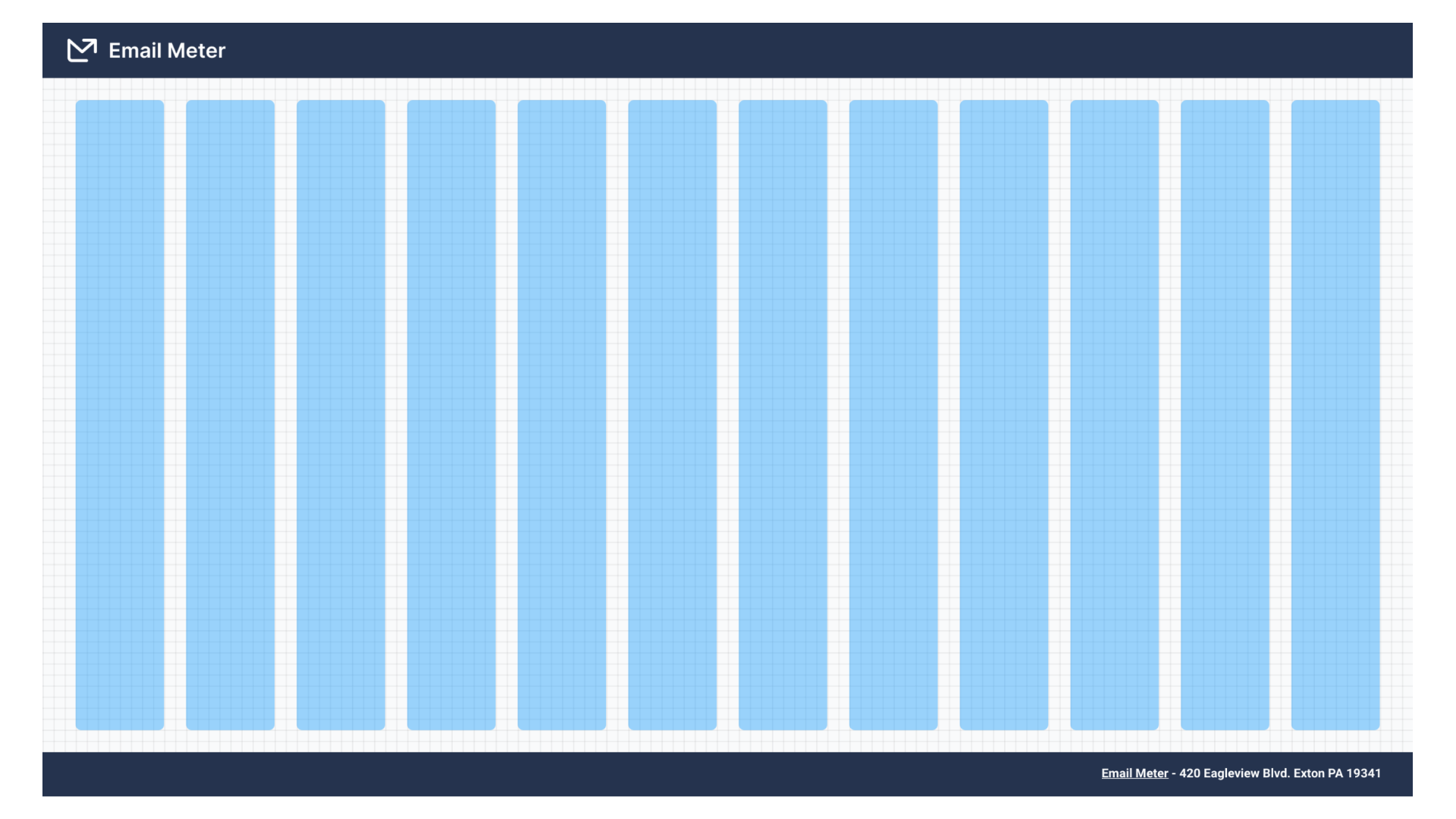
The grid
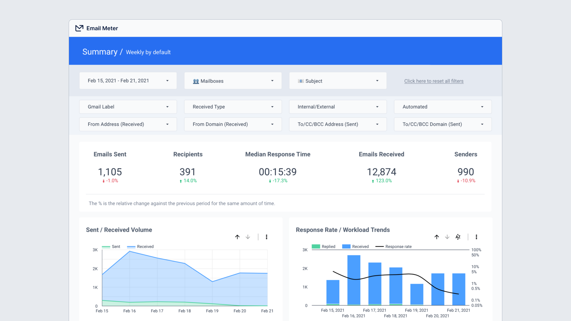
Every dashboard must keep a consistent structure. We do so by applying a 12-column grid fitted inside a 30px horizontal margin, and 20px on the vertical axis. You have to make sure your Data Studio dashboard grid is set up to 10px.
We also decided that the grid would be contained between a header and a footer at all times, for context.
The components library
It doesn’t make sense to build this header and footer every time, so we decided to create another Data Studio dashboard that contained patterns and examples on how to build these and other components. The magic here is that you can simply edit this dashboard and copy/paste the component you want to use in your dashboard, which will already be neatly styled.
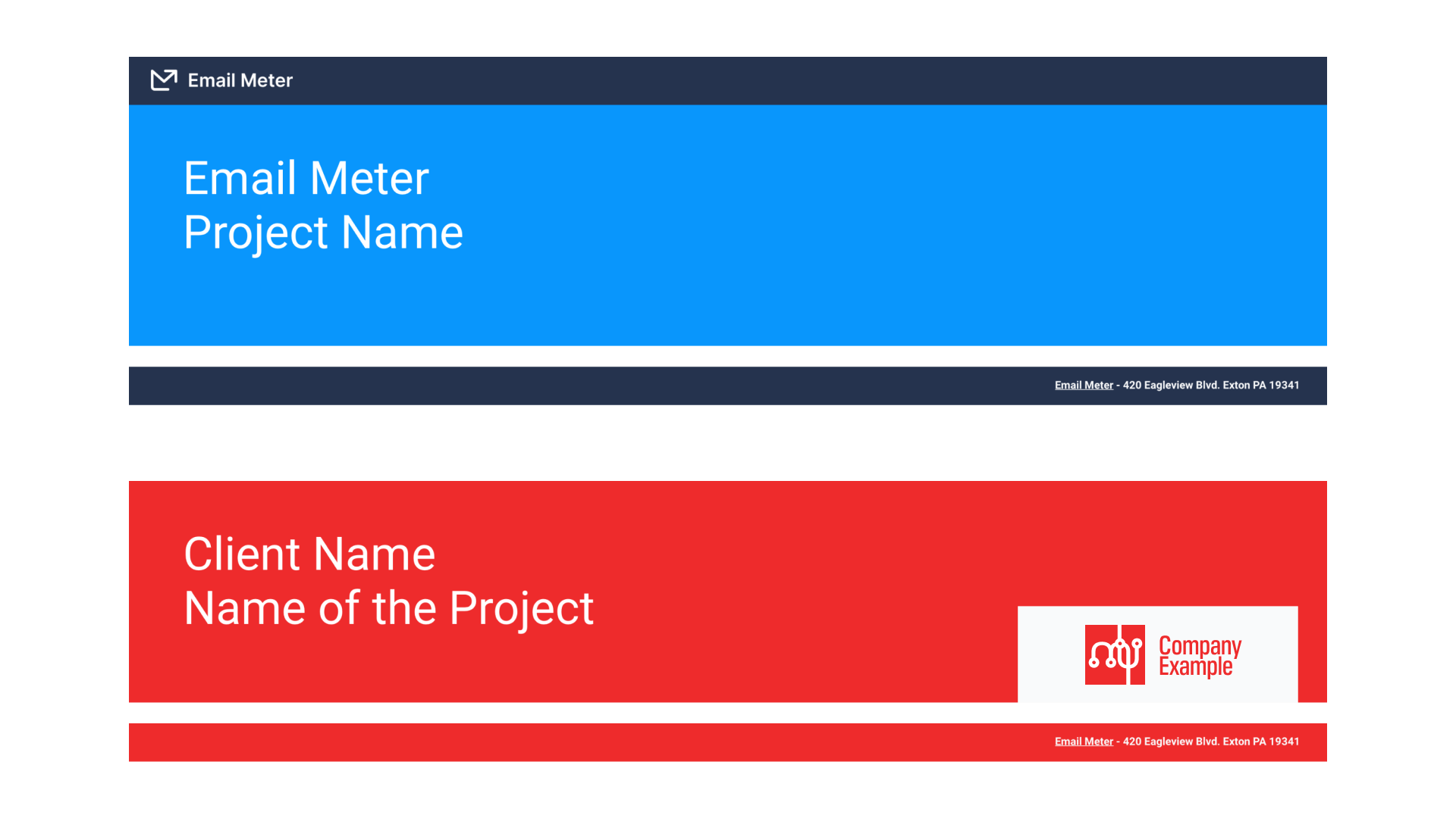
Header, footer and branding layouts
Some of our dashboards will be displayed on TVs at our customer’s headquarters, so sometimes they’re 100% branded for them, while in other cases, the brand for the dashboard is 100% Email Meter. There are also cases where both brands should co-exist peacefully.
We solved this problem by providing a page in our component library with 12-15 examples of different footers and headers, with different branding predominances.
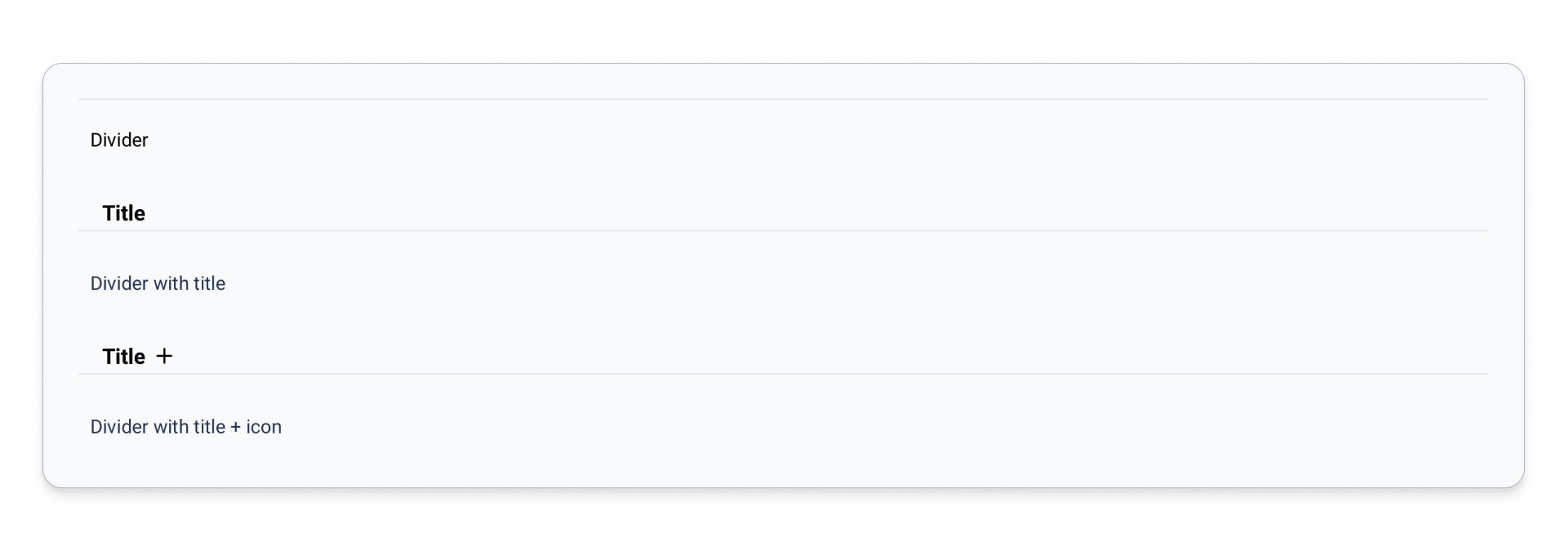
Dividers
When composing dashboards, you need to contextualize and set spaces for different types of metrics or just to create sections that set the pace for the data narrative. We added a set of dividers that could be easily reused.
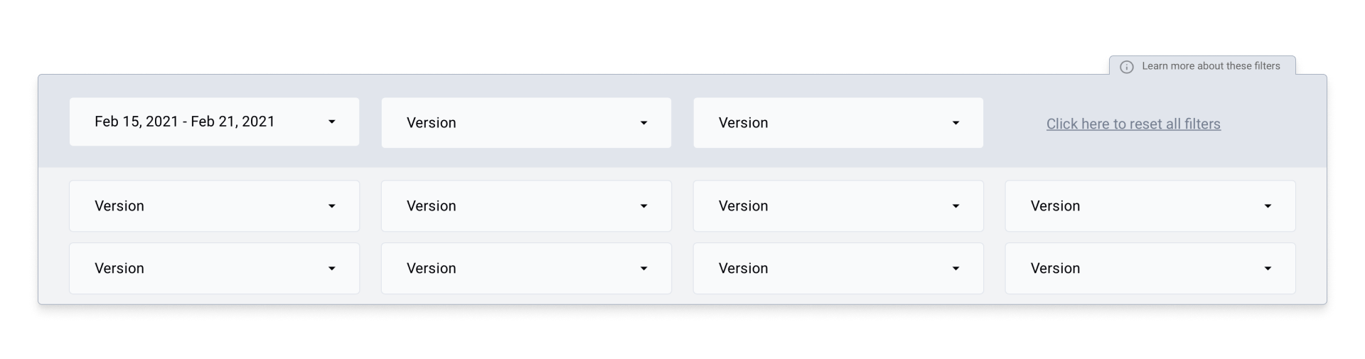
Filters
Oh — How cool is it to offer a dashboard and give full power to the user to narrow down their search, include or exclude whatever they want and report only on specific segments? We leverage this functionality quite often, making our dashboards fully interactive so our customers can filter by team, office or email sender. Or maybe get metrics like response times for emails with certain subjects or labels.
In order to give them a coherent and clean appearance we designed another page that contains each of the items for the filter bar, with different added elements like external links or buttons — we also put examples together on how to combine them or add hierarchy.
The emojis are the sparkle on the cake! They give more context to what each filter does.
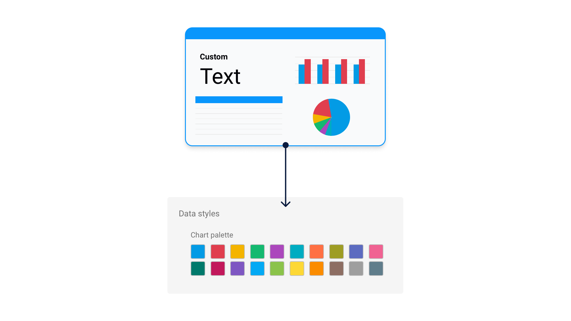
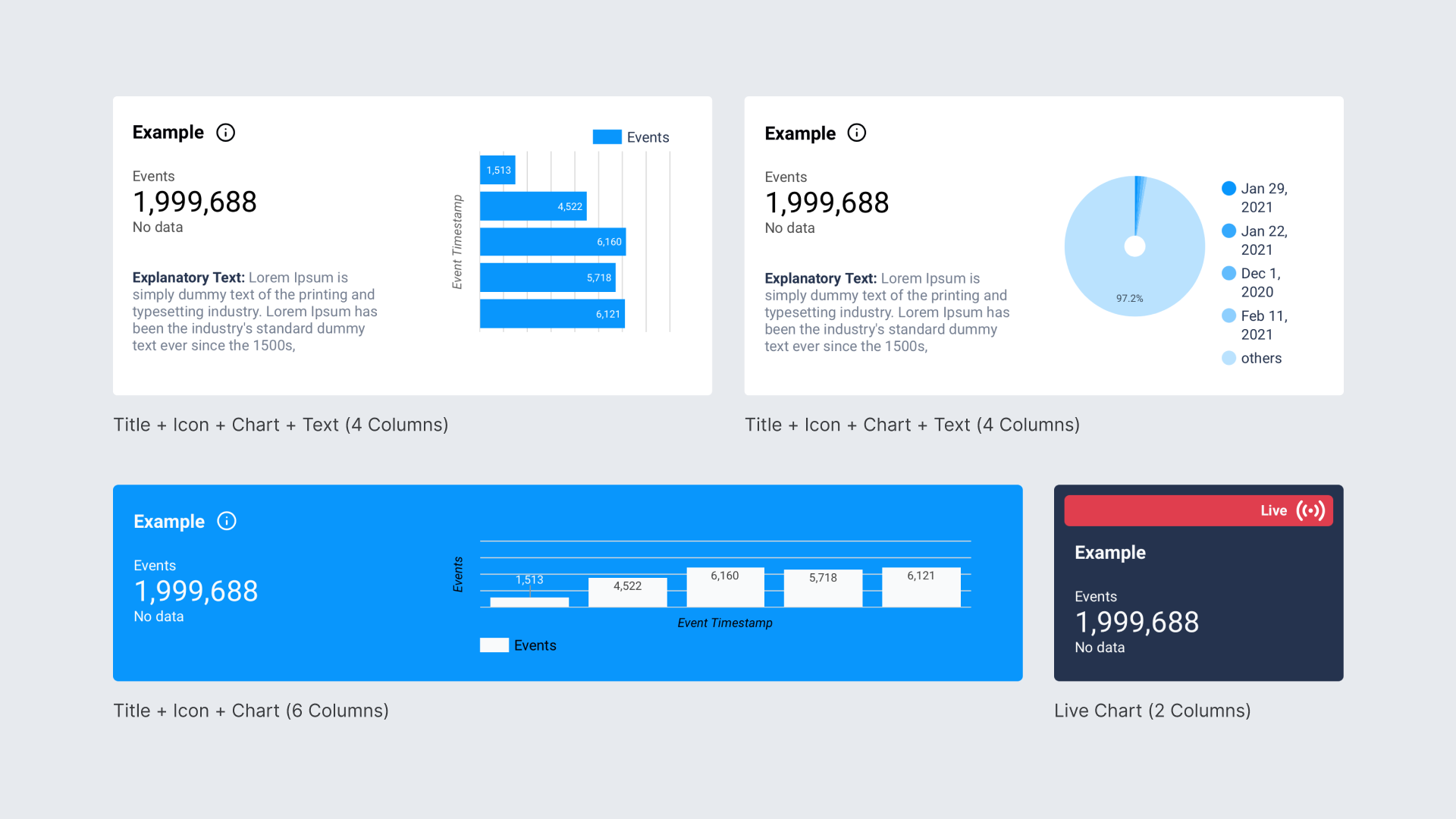
Widgets & Data Visualization
And lastly, we needed great examples, tokens and patterns that could be used when visualizing actual data and charts. We thought of this page as a guideline that contained the different atomic units that the dashboard developer could later use and combine as they see fit.
So apart from creating the base widget card styles, we went ahead and proposed different ways of integrating explanations and insights with the actual data.
Plus, we also created an example for most of the charts and options available in Google Data Studio (line charts, pie charts, bar charts, trendlines, scorecards with different sizes…) so that the data visualizations were also neatly integrated into the beautiful containers that you could now compose yourself.
Putting it all together — The workflow
So now, every time we’re faced with a new dashboard, we follow this simple workflow:
- First we copy any of the template dashboards.
- We define the new content that’s going to be created in very open requirements (IE: we don’t need to define very detailed visual requirements that would slow the process down).
- The dashboard maker uses the components library to create the new content in a consistent visual way.
- In the QA process the details are adjusted by the design team.
Final thoughts about designing in Data Studio
We hope this has been helpful! In our experience, Google Data Studio has proven to be very flexible from a design perspective (actually way more than other expensive premium BI tools), and we just needed a way for it to be more consistent. In some other ways it’s also limited, since the lack of an API makes scalability and consistency difficult to achieve.
For now, our proto-design-system solved that problem marvelously, as the dashboard creation process is twice as fast now.
And the results are stunning!
With a workflow and a methodology like this, we are also able to apply more creative decisions only where needed (like building complex narratives) and even in those cases we don’t have to rethink everything from start to finish.
Plus, the visual clarity and consistency gives more value to the end user, who is now more than able to understand and improve their email-related KPIs.
If you have any suggestions or questions, let’s chat at hello@emailmeter.com!


